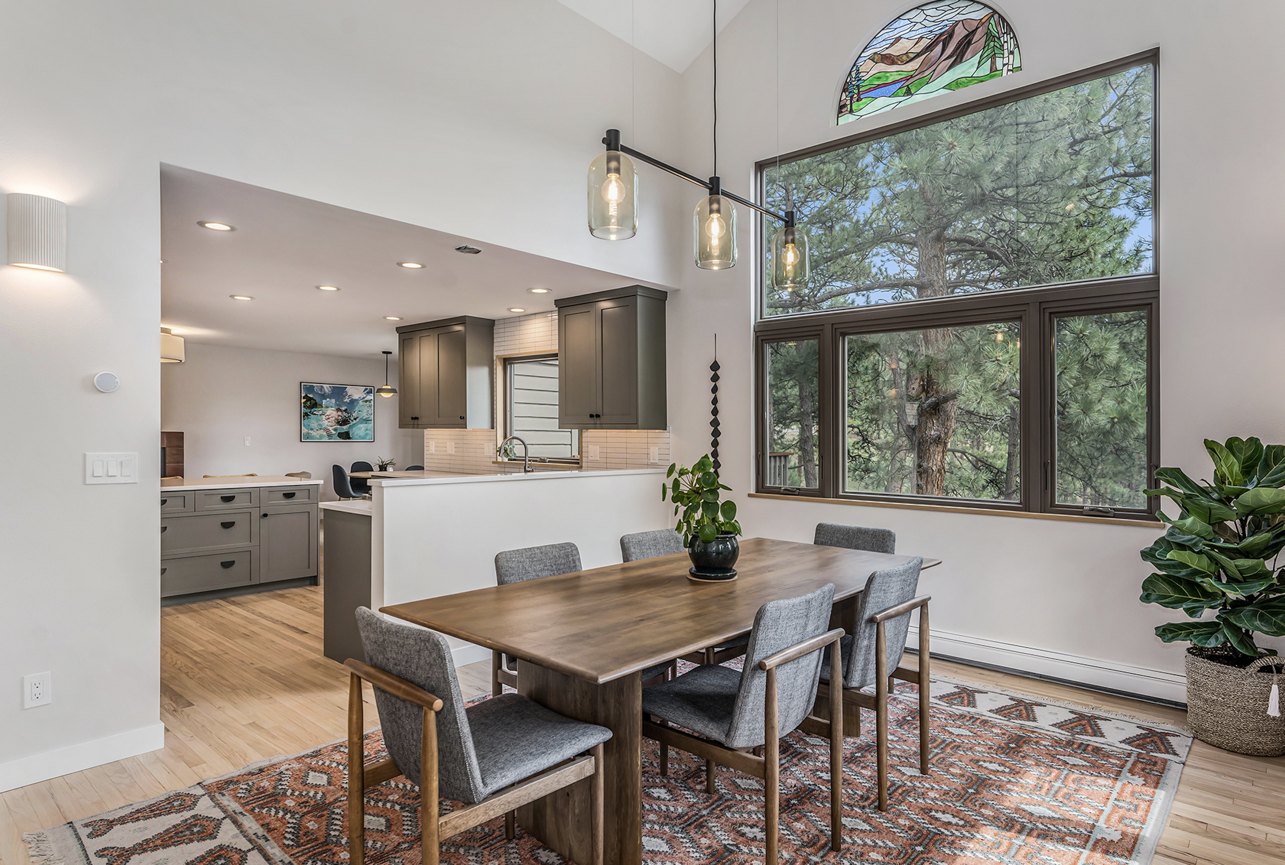
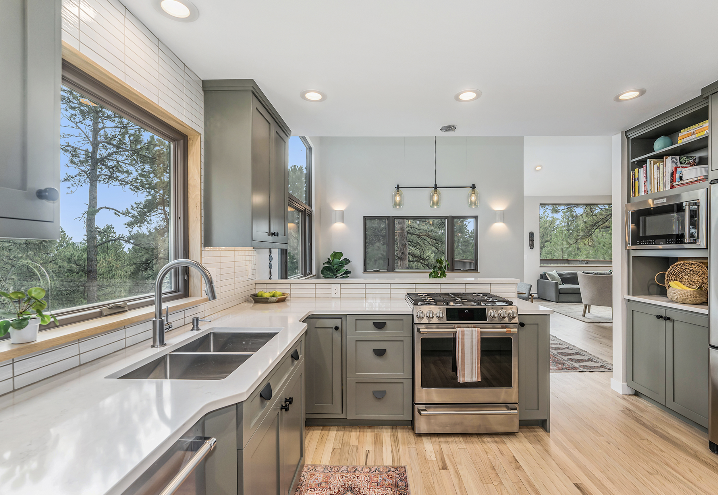
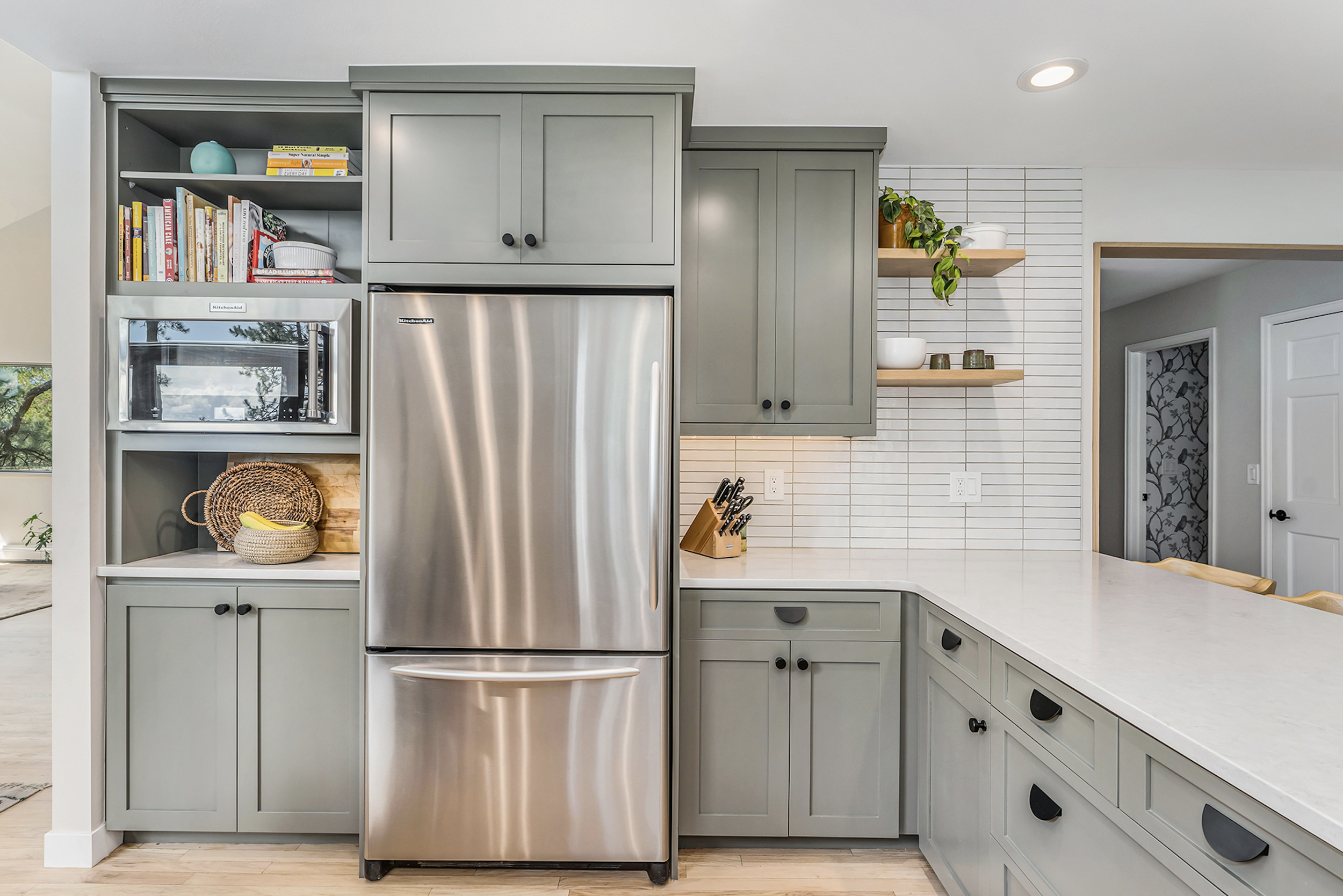
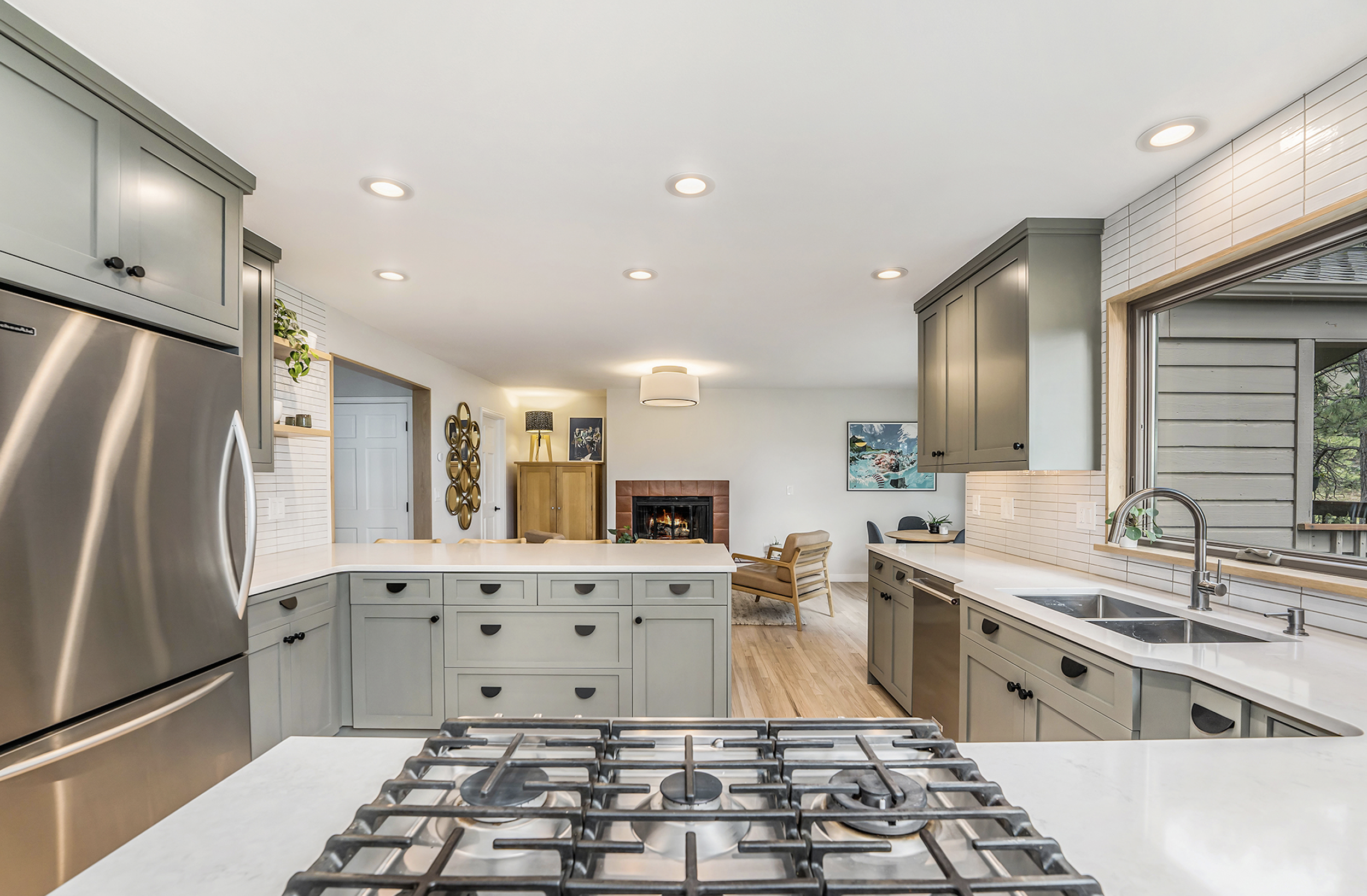
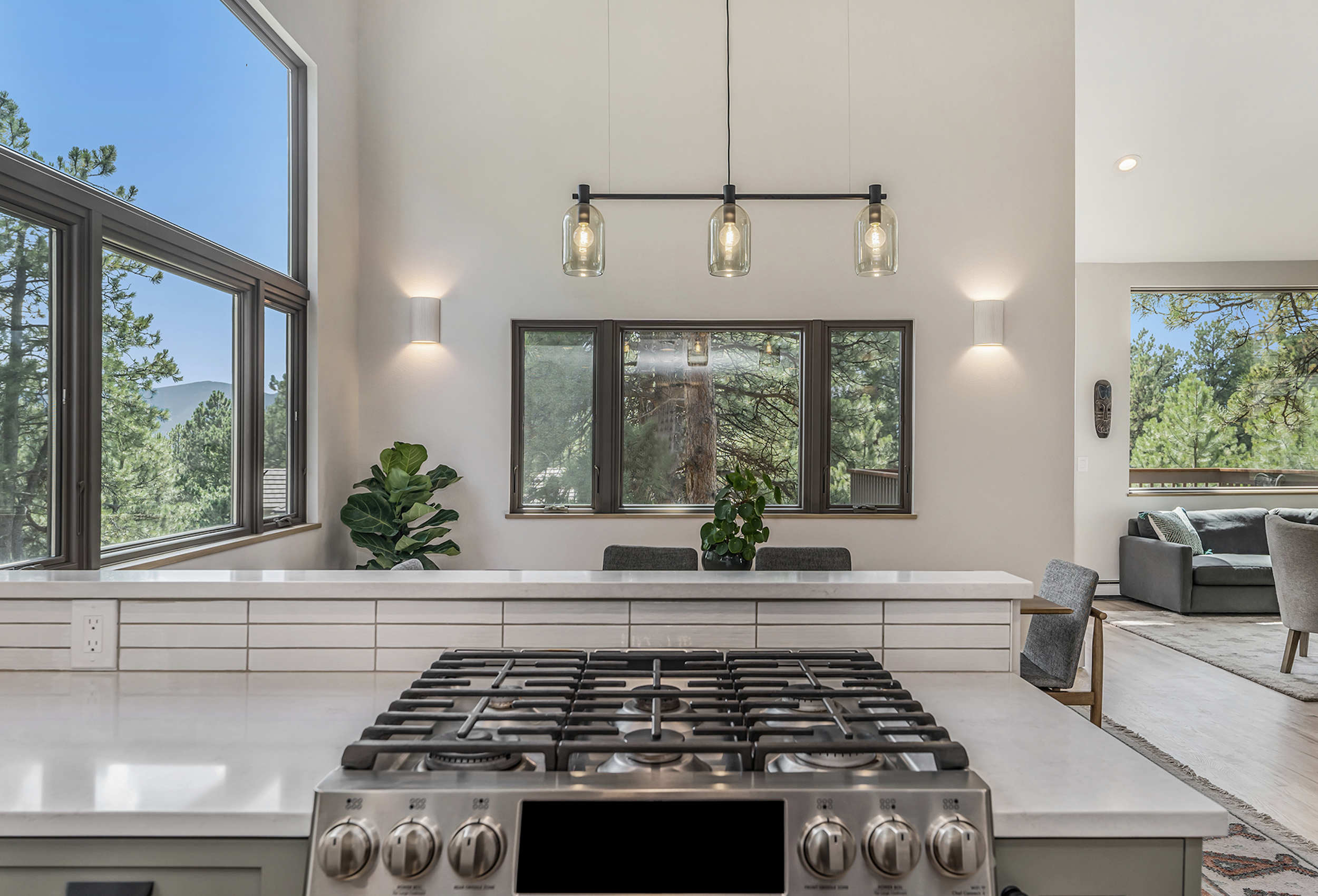
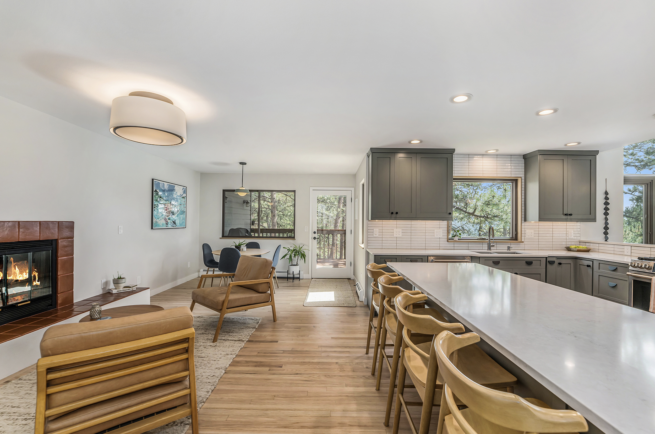
“We moved into this home in July 2021, and the kitchen felt closed off, dark, and just not our style,” said West + Main agent and homeowner Julie Lunn. “It felt too brown and rustic, and we wanted more natural light and re-flectivity in this space as well as more contemporary finishes. The dining room was also closed off and terribly outdated, with huge valances over the windows, wing walls separating the dining space from the living room, and some chair rail details that just weren’t working. Lucky for me, my husband Eric is a general contractor and masterful framer/carpenter, so he came up with a plan to support opening up the wall from the kitchen to the dining space, which then flooded the kitchen with light. The dining area walls were non-structural and 15 feet tall, so they were just a large demo project!”
"We wanted to keep as much as of the existing materials/appliances as we could but make it our style which we feel is more clean, modern + warm, white + wood, clean lines + organic touches," said Julie. "For this project I called it Modern Chalet. We are also both from Minnesota originally so are heavily influenced by Scandinavian design."
“Being in a mountain environment, it didn’t make sense to go too starkly modern. That said, we just aren’t really into a cabin or super woodsy/rustic feel either.” said Julie. “Our goal was to update the space but make it feel right in this casual but gorgeous natural backdrop. And because we don’t know if we’ll stay in this home forever, we hope we created a look that is at least somewhat appealing to others in case we decide to sell!”
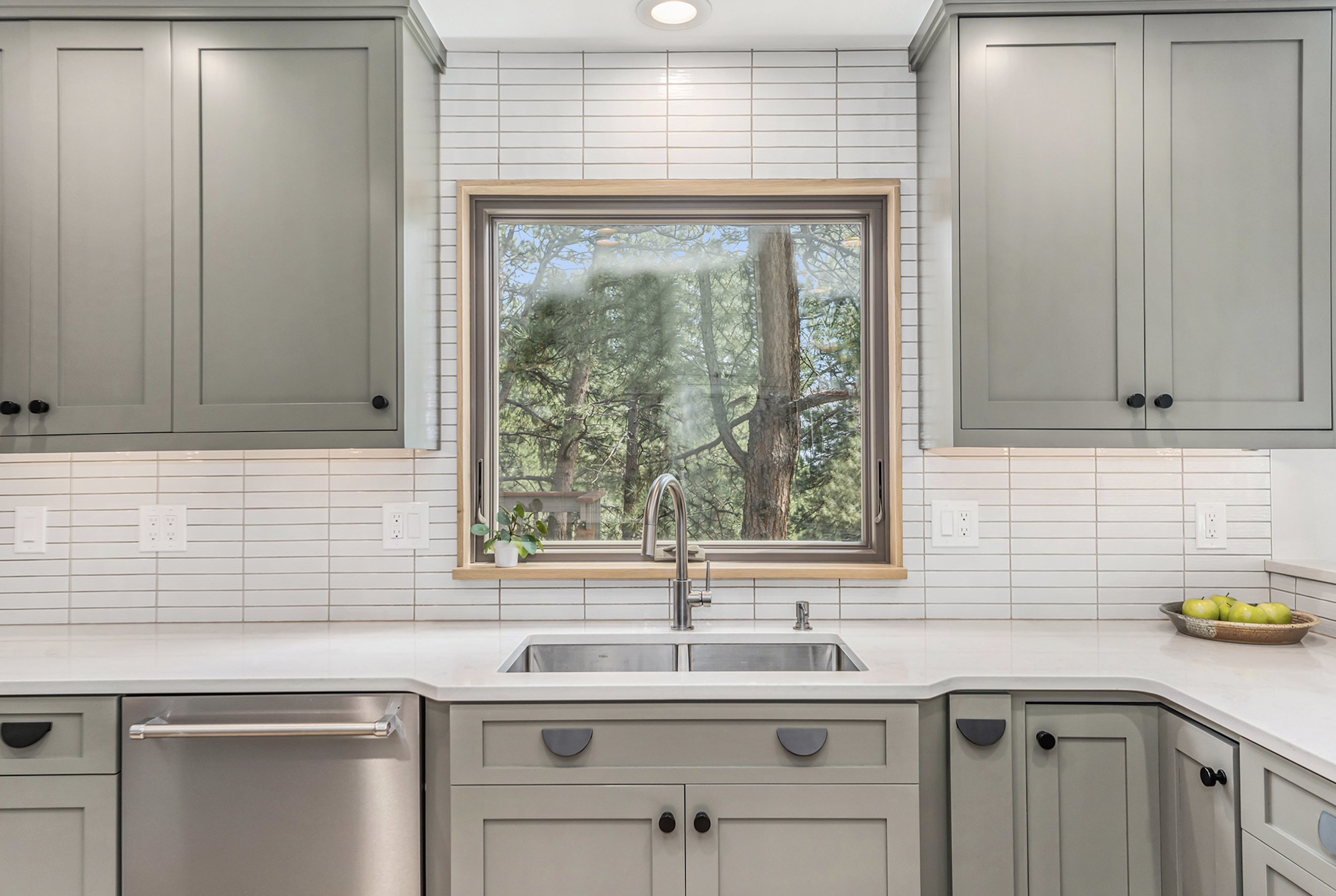
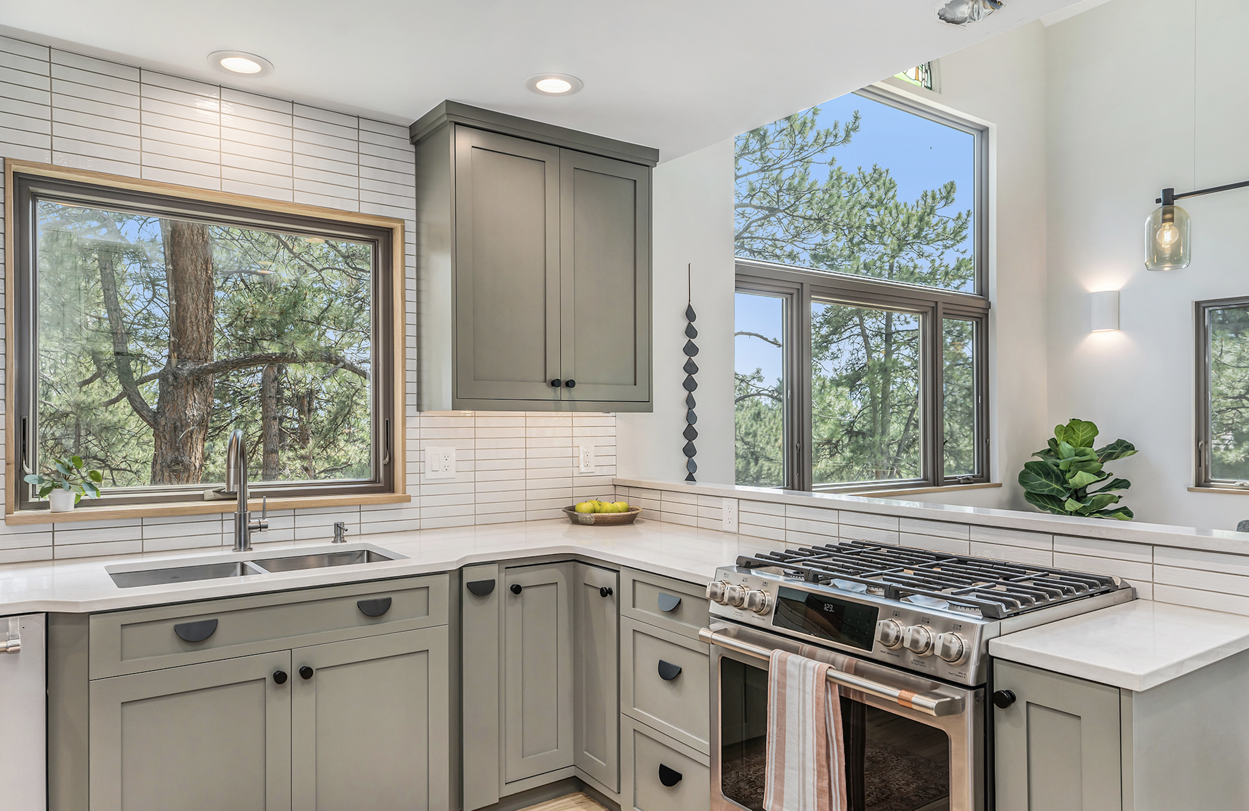
"At first we considered lighter cabinets with a darker countertop but eventually landed on a beautiful earthy green cabinet paint topped with light quartz countertops and a slightly organic white ceramic tile for our backsplash," said Julie. "The cabinet paint color is one that you would never have picked just looking at the chip, but after trying many greens, this one felt the most grounded and chameleon-like based on the light in the space. It was important to us that we wouldn’t get sick of it and that it had some neutrality in its tones, so we chose a green that is less bold than some of the current trends."
“I firmly believe that your space needs to reflect your style and that when you feel totally at home you have more energy to bring your best self to your family, life and work,” said Julie. “What I love the most is that I feel totally at home in the space now – not like I’m staying at my great aunt’s house, as nice as it was. I also love the light that we get throughout the day. My favorite finish detail is the modern white oak trim Eric put around the window and how the white tile joins up with it perfectly. I admire it while I do the dishes!”
Materials and sourcing
New cabinet paint: Sherwin Williams Thunderous 6201
Cabinet hardware: CB2
Countertops: Nustone Belford quartz
Backsplash tile: Daltile: Cepac tile
Dining room light: bludot
Related Links
If there is a home that you would like more information about, if you are considering selling a property, or if you have questions about the housing market in your neighborhood, please reach out. We’re here to help.


