Esther + Thomas Leytush, clients of West + Main Agent Elizabeth Fischer
“When we were buying our house, we chose this one in part because of the many projects it needed, knowing it would be amazing to put in the work to bring it back to beautiful life. ”
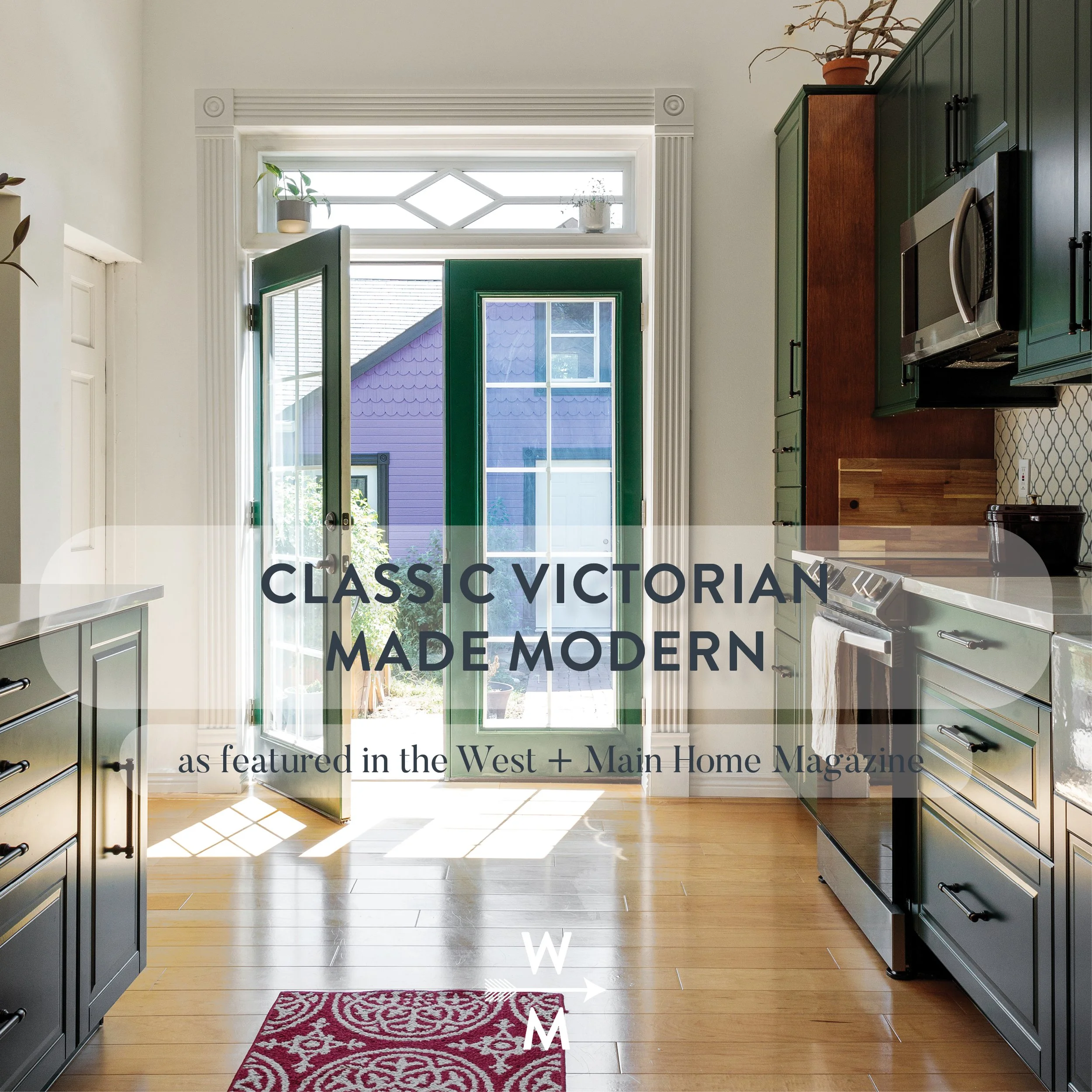
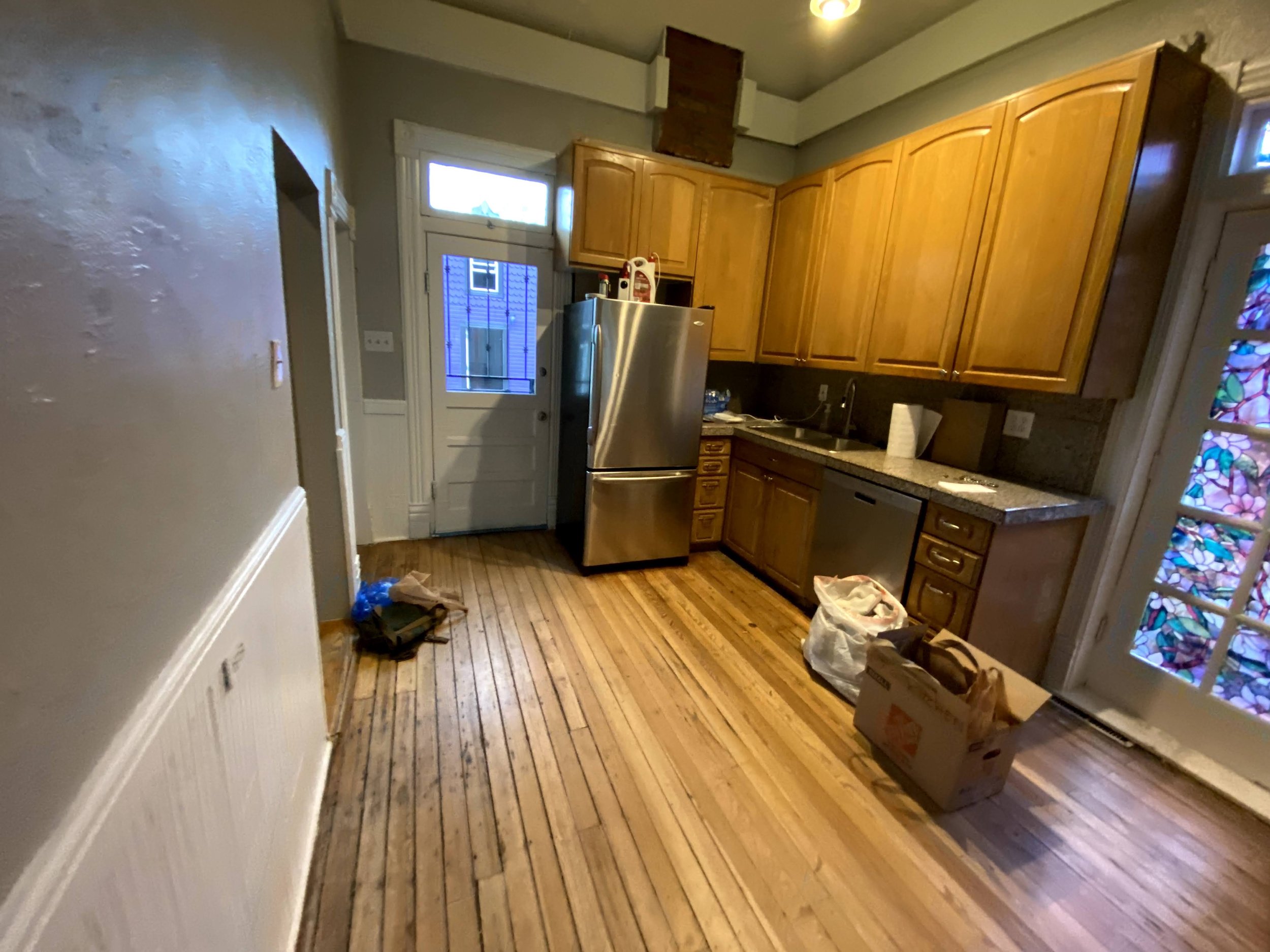
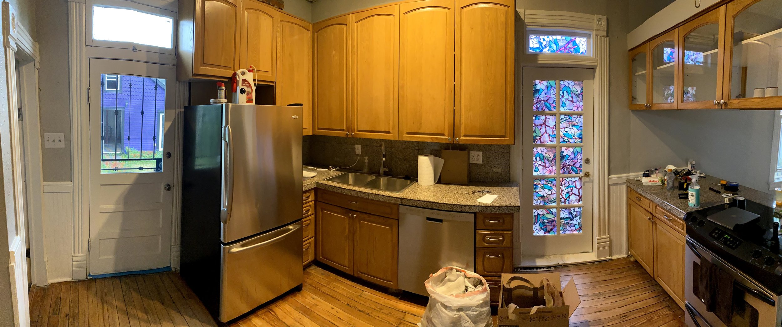
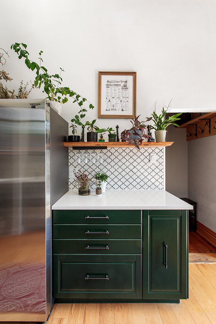
“This house is 136 years old and there were numerous changes that were just tacked on, especially in the kitchen - for example it had 2 doors out into the backyard but no windows, a cramped and dark main kitchen area, and two L-corners that broke flow. The original kitchen was really a small kitchen spread over a large footprint. As for inspiration, we have a shared love of the Dark Academia aesthetic and it was a clear fit for this Queen Anne Victorian house - we wanted a modern Victorian feeling.”
“The nature of our project was that our design meant ripping out the entire kitchen as well as breaking and rebuilding walls, fixing structural issues, redoing electric and plumbing layouts, re-leveling and laying a new floor, putting in all new drywall over all new framing and insulation, putting in French doors and a window, and only at the very end putting in new kitchen cabinets and appliances. We spent just under $25k, of which $14k covered contractors and $11k covered materials and appliances. We were able to come in so low on materials and appliances because of choices like buying all our cabinets and countertops from Ikea and putting them together ourselves, as our research showed that Ikea cabinetry is excellent quality and lasts well over their 25-year warranty. We also made choices like buying engineered hardwood planks for flooring and making our own wood accents thanks to Thomas’s love of carpentry projects.”
Before:
“For the main aspects of the kitchen, we stuck with Home Depot and Ikea and have been happy with that, but also spent time hunting for cool brackets and other details from antique stores and salvage centers. I was also shocked and thrilled to discover that we could purchase newly made rosettes and molding from Tabor Millworks https://www.tabormill.com/ that were the same design as the original molding in the house.”
“The final result was much more beautiful and character-full even than we had hoped. We did not realize we would encounter multiple points where our contractors or us would notice details or questions we had missed in our plans, and because our costs were able to stay low we were able to make choices to create cleaner lines, grander openings, better lighting, and much more. In the end, we felt like we could have gone with an even smaller kitchen, even though the footprint of the new kitchen is actually smaller than the original that we had demoed.”
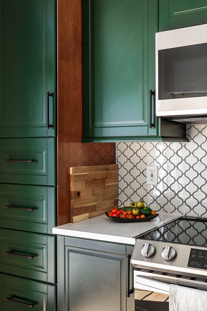
“For Thomas, since we matched the new archway with the rest of the house, it has become so much more inviting to just flow from one room to the next and into the backyard. For Esther, my favorite things are the wood accents that Thomas built - the beautiful large wood shelf with gorgeous Victorian-like routed edges that now hold the majority of our plants, the wood windowsill, the little wood shelves he built to make use of the dead space next to one of the cabinets which now stores all the cutting boards and cookbooks. We also love the bright light in the space, the way the dark green colors of the cabinets create a sense of elegance, and the way it feels so easy to cook in it because the flow is top notch - plenty of counter space, good organization with big drawers instead of standard lower cabinets, a big sink, etc.”
Related Links
If there is a home that you would like more information about, if you are considering selling a property, or if you have questions about the housing market in your neighborhood, please reach out. We’re here to help.
